
Buried - Splitgate 2
Introduction
In this project, I created a Splitgate 2 level set in an underground spaceport.
(this project was created for fun and personal growth, and is not associated with the game itself or 1047 Games)
Project Details
the level can also be played in Splitgate 2
disclaimer: this map was created in Splitgate 2 before the rebranding / rework of the game to Splitgate: Arena Reloaded

DESIGN
design - Goals
Early on, I outlined a few core goals to guide the map’s direction:
-
Reinforce Portal mechanic as much as possible
-
Emphasize verticality to encourage three-dimensional thinking and traversal.
-
Support varied playstyles by including spaces for long-range and close-quarters combat.
Initial Approach
For this project, I decided to take a different approach compared to my usual workflow. Instead of doing extensive research on arena shooters or studying Splitgate in depth, I jumped straight into development with only a rough idea of what might be fun or interesting.
The goal was to make as many mistakes as possible early on. By doing this, I could revisit the work only a few days or a week later and clearly identify areas for improvement, learning from my own design flaws in short amounts of time.
Through this trial-and-error process, I quickly noticed a few important things about Splitgate’s design philosophy:
-
The game heavily rewards players who have mastered its movement system. Navigating efficiently is just as important as aiming.
-
Flow is critical. Players should never find themselves in a dead end without the option to place a portal and escape.
-
Traditional half-cover isn’t commonly used. Most areas are designed for fast movement, with only the objective zones encouraging slower, cover-based play.
-
True dead ends are avoided. Every position on the map offers some way out - players shouldn’t be able to sit in a corner and farm kills.
Additonally, I didnt focus on creating a full top-down layout at the start but rather focussing on the main idea and working off that in the editor.
design - Layout
Circular Layout
Roughly inspired by the architecture of Utapau from Star Wars, this level features a circular layout with multiple floors built into the surrounding walls and a large open space at its core.
This structure allows objectives to be placed on different vertical levels, encouraging players to constantly shift their tactics. A team that excels at long-range engagements, for example, won’t dominate every scenario - each objective location presents a new challenge and demands a different approach.
By forcing players to adapt, each shift in objective placement has the potential to swing the momentum of the match.

Utapau References

No-Mans Land
I added a central no-man’s land to create a clear risk vs reward dynamic.
Information as a Ressource
The open center offers players more than just fast traversal - it becomes a source of valuable information. Spotting enemy movement or ongoing fights gives players a strategic edge, especially in team-based modes.
But gaining that info comes with risk. With limited cover, entering the middle means exposing yourself to enemy fire. It’s a choice: stay safe and blind, or take a risk for crucial intel.

Power Weapon Placement
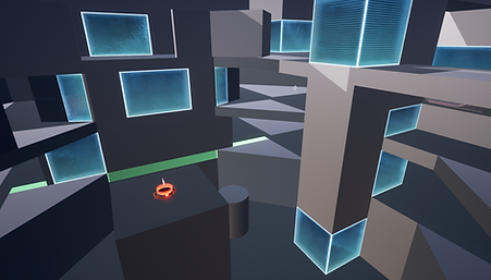
Power weapons spawn in the center, forcing players to assess the risk before going for them. Grabbing one puts you in full view from multiple angles, making timing and map awareness just as important as the weapon itself.
Navigation and Orientation
One of the main pieces of feedback from early playtests was a sense of disorientation - players often felt lost, as the grey blockout offered little visual variety or reference points.
Addressing this became a top priority. To improve navigability, I introduced clearer visual cues through color coding, unique room layouts, distinct points of interest, and small landmarks.
These helped players quickly recognize where they are and where they need to go.


design - Thoughts on how to make the level fit my goals
Supporting Flow
To support flow on a larger scale, I designed the level with a circular layout. This made it easier to avoid dead ends and kept players moving through the space without interruption.
Supporting Different Playstyles
To support different playstyles, I leaned into the map’s verticality and layout. By creating unique playable areas, I was able to create different spaces throughout the level, dedicated to different playstyles.
Supporting Movement
The level was built to encourage portal use and fluid movement. While players can move between floors using standard paths, the layout favors those who use portals efficiently, offering faster and more dynamic traversal - rewarding skillful movement without punishing less experienced players.

Choices and Opportunities
The open center is the quickest way to cross the map - ideal for supporting teammates, reaching objectives, or setting up portal plays. But that speed comes at a cost: exposure.
This tradeoff gives players more choices in how they approach each situation, encouraging on-the-fly planning and varied tactics.
design - Gamemodes
When designing the map, there were certain gamemodes I wanted to make playable in the map:
King of the Hill, Team Deathmatch, and FFA.
For all of them, there were certain design aspects I needed to pay attention to to get them right:
Objective Location
Spreading the objective locations evenly across the map in unique and memorable locations was key.
With Splitgate 2's map design generally not using half cover as it usually hinders gameplay flow, the few obstacles used around objective locations should not obstruct play during other game modes.


Spawn Locations
Spawn locations were something that made negative impressions during the first tests. This was a result of spawn locations often being placed in spots that were quite open, making you an easy target right after spawning.
Additionally, it was not always recognisable where you spawned in the map, leading to more confusion as players needed to spend their first seconds just trying to figure out where they even were.
Balancing
Balancing is something I struggled with for many parts of the development. The Semi-Symmetry that originally existed in the map was the main reason for that. (described more below)
Reworking the map to make it fully symmetrical solved a lot of the problems there. Additionally, Portalwall placements were important to keep in mind, as some original portal placements made it very easy to control some areas or objectives with little effort or danger.

ITERATIONS
iterations - Questions I wanted to answer at different stage of development
First Prototype / Proof of Concept
» Does verticality fulfill its intended purpose?
» Is it too much verticality? Does it feel uncomfortable?
» Does the open space in the middle fulfill its intended purpose as the quickest way to traverse the map using portals?
First Version in Splitgate 2
» Does the open space in the middle fulfill its intended purpose in providing a clear risk vs. reward situation to reach weapon pickups?
» Does the player always know where they are?
» How do players use their portals? More passively to escape or aggressively to attack?


Later versions
» As Splitgate usually has more open spaces in their levels, how does CQB work best?
» Are there too many portals?
» How do I improve navigation and orientation? What could be used to make spaces unique and memorable?
iterations - Problems I encountered:
Here are some of the issues I faced during the development of the map. For all the problems listed below, a big challenge was to fix them while still keeping the main design goals of the level in mind and keeping the level in line with its original vision:
1. Metrics
2. Footstep Sounds
3. Navigation and Orientation
1. Metrics:
In earlier versions of the map, there were a lot of bad jump affordances - spots that looked like you could reach them with a jump or jetpack, but you’d come up just short. This often led to confusion or frustration during traversal.
After taking a closer look at how official maps handle verticality and getting some feedback, I went back and adjusted almost all areas, making height differences more readable so it’s immediately clear where the player can and can’t go.
2. Footstep Sounds:

With the original layout of the level having 3 layers vertically stacked above each other, you could hear footsteps of an enemy 2 floors above you.
This lead to players often confusingly searching for an enemy they just heared above or below them as they were not able to recognise that the enemy was actually 2 floors away, resulting in a frustrating search for the enemy in the wrong area.
For example, if you were running around on the bottom level hearing an enemy above you and seeing their icon pop up on the minimap, you wouldn’t know if they were one or two levels above you.
Therefore, people looking to fight an enemy that they heared above or below them often went to a different level only to find no enemies.

It might seem like a small issue at first, but it ends up blocking sound from being a useful mechanic in the game.
To fix the problem, there were various solutions I considered. From just moving one vertical layer to the outside to shifting the different layers so they are not stacked right above each other, each idea came with positive and negative features that often broke the original vision and design goals.
In the end, I decided to delete one of the layers. This removed the problem while giving me more options to play with verticality on a level locally within each of the vertically stacked layers.
This solution still offered nice verticality while helping with orientation as well. It solved the sound and minimap problem and supported other visions of the map as well.
3. Navigation and Orientation:
Throughout the development of the map, this was the problem people most commonly spoke of. Through the feedback I received, I was able to narrow down this broad topic to 3 main reasons why this issue arose many times:
3.1 an unclear environment idea
3.2 a semi-symmetrical layout
3.3 too many complex angles
3.1 an unclear environment idea:
The original environmental idea for this map was to create a military base located in the ground of the planet, mainly inspired by Utapau. The early stages of blockout included a dock for spaceships at the top for them to land on.
This original idea of a military idea was lost through iterations, however. To fix it, I brainstormed for environmental themes that would be interesting and unique while still fitting the futuristic theme of Splitgate.

In the end, I was inspired by another environment from Star Wars that fascinated me when I first saw it live, the destroyed underground city on Mandalore.

Bringing it all together, the final environment you play in represents a spaceport where ships deliver supplies and bring civilians from other planets that would enter the underground city through this location.
”Buried”, a theme and the name of this map, however, does not refer to the playable area where you can see out of the ground. It represents the big city underground that you can see from the vista in the map.
Through this idea, I was able to create more unique and recogniseable POIs and gameplay spaces.
Here are some examples:

The Cargo Bay
The area where containers containing supplies, gear, and more for the underground city are being stored until their departure into the city itself.

The Utility Area
The space where pipes and machinery are located to keep this spaceport up and running, and where the pumps are located to prevent the station from flooding.


3.2 a semi-symmetrical layout:
Another cause of the orientation problem was the “semi-symmetry” that existed throughout the maps' layout for a long time. This was a result of early attempts at creating unique gameplay spaces.
This meant that parts of the map were symmetrical while others were not, leading to a lot of confusion. This made it even harder to learn the map and recognise individual spaces, often making it difficult for players to figure out how to get to a certain place they wanted to go to.
To fix this, I decided to go with a fully symmetrical map.
This made the map easier to learn and more beginner-friendly, while still offering complexity through the use of the movement mechanics and portals, leaning into the phrase “easy to learn, hard to master”
3.3 too many complex angles:
Lastly, a problem leading to confusion was an extended result of the semi-symmetry: too many weird and complex angles.
Because of the semi-symmetry and the 3 vertical layers stacked above each other, you could get shot from too many random angles without ever knowing where it was from and that this angle even existed. This was a common occurrance, especially around places where you could traverse from one layer to another.
This issue was tackled by making bigger statements with the geometry to simplify the layout a bit and remove small weird angles and pixel-peaks.


iterations - Splitgate 2's map editor
Updating to Splitgate 2
While working on the level in Splitgate 1, the beta for Splitgate 2 launched, introducing a new level editor: The Lab. Since the project was still in its early stages, I decided to rebuild the level in Splitgate 2 to take advantage of the updated tools.
This came with some challenges. The new editor featured a different interface, controls, and workflows that took time to adapt to. Some mechanics also changed - most notably, power weapon spawns.


Differences to Splitgate 1
In Splitgate 1, weapon spawners were assigned specific weapons, allowing me to design each area around a certain playstyle - like placing a shotgun on the lower level or a sniper up top. Splitgate 2, however, uses random weapon spawns, which led to unbalanced moments, such as many rocket launchers appearing at once.
That said, Splitgate 2 introduced loadout-based classes, which made this system less essential. Since players can now bring their preferred weapons into the match, weapon spawners were not needed anymore to achieve that goal.
Additionally, iteration cycles overall took longer as well. The reason for this was that you have to publish the map to be able to start a custom match in Splitgate 2. As you are not just able to start a bot match to test your changes, looking at and examining your work costs way more time.
Iterations & Feedback
Thanks a lot to all the people that provided feedback, with special thanks to Garrett Billian, an actual level designer from Splitgate 2, that provided me with very helpful feedback and insights.